Techniques for Layering Image Prompts
One solid tip for image prompts is to compose them in layers, with the background, subject, and lighting/camera each described separately. This got me thinking if the order of the layers matters, how so, and what would yield the best results. So I got prompting.
Top Down vs Bottom Up
It seems like there are two main ways to go about this, which I’ll call top down and bottom up. Top down is where everything is in relation to and flows down from the main subject. Bottom up is where a world is built up and then the subject is placed in the world.
Top Down
This is the most common way to go about it, and it’s what I’ve been doing for a while. Start with the most important main subject(s) first, then describe the background or scene, then mood, lighting, and camera.
Bottom Up
But the more I thought about it, reordering these layers, it seemed like maybe that was backwards and needed to be flipped around. Not even starting with the background or even lighting but going all the way down to the camera/lens/film. This primes the model with the basic idea that it’s making something photorealistic and how the main texture and focusing is going to be. Then the lighting, which is always the most important part of photography and what really separates good generations from bad ones.
With the basic physics of the world laid out, then the background can be added in with its details. Finally now with a whole world already built up, the subject just naturally fits into it.
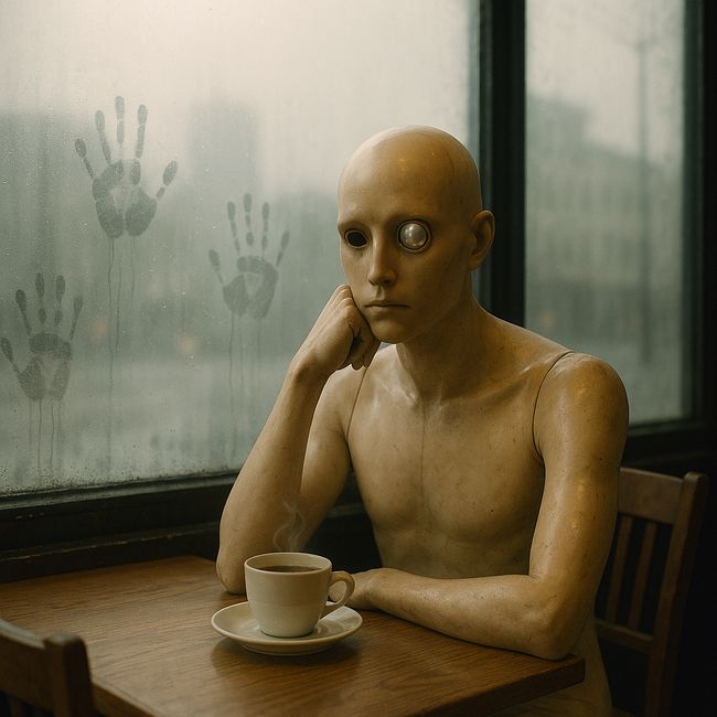
Notice the handprints on the glass? That part was completely ignored in the top down approach.
Prompt Example
Top Down
Front and center: an ultra-macro view of a spider-silk web strung between two reeds, each thread precise and glistening; the web is studded with perfectly spherical dew drops, one larger drop at the nexus acting as a tiny fisheye lens that crisply inverts the entire lakeside horizon—sky, waterline, reeds—within its curved surface, while the smaller surrounding drops echo fragments of the scene.
In shallow focus behind, a blurred reed-lined lakeshore dissolves into soft pastel fog, suggesting quiet stillness without drawing the eye.
Golden-hour side-light from a low, rising sun cuts through cool pre-dawn mist, producing a soft, warm rim on everything it touches while the shaded areas remain gently blue-grey.
Camera: 100 mm macro lens, f/5.6 for a thin depth of field that isolates the central droplet, 1/250 s, ISO 200 on a tripod; white balance set to “Daylight” to preserve the warm-cool contrast.
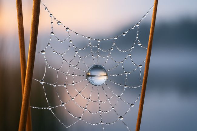
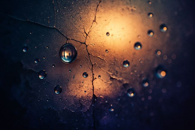
This is a more charitable example. The image is technically perfect and pristine.
Bottom Up
Camera: 100 mm macro lens, f/5.6 for a thin depth of field that isolates the central droplet, 1/250 s, ISO 200 on a tripod; white balance set to “Daylight” to preserve the warm-cool contrast.
Golden-hour side-light from a low, rising sun cuts through cool pre-dawn mist, producing a soft, warm rim on everything it touches while the shaded areas remain gently blue-grey.
In shallow focus behind, a blurred reed-lined lakeshore dissolves into soft pastel fog, suggesting quiet stillness without drawing the eye.
Front and center: an ultra-macro view of a spider silk web strung between two reeds, each thread precise and glistening; the web is studded with perfectly spherical dew drops, one larger drop at the nexus acting as a tiny fisheye lens that crisply inverts the entire lakeside horizon—sky, waterline, reeds—within its curved surface, while the smaller surrounding drops echo fragments of the scene.
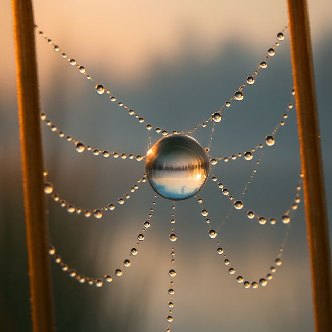
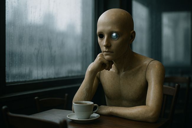
This one is more lofi but seems more real.
Conclusion
It turns out the order of the layers does matter and quite a bit at that. This is another example that these models are mysterious and the phrasing of your incantations is important. Like why did it make the top down images 3:2 and the bottom up 1:1? Why does it do anything.
